Onboarding
A first launch in a few slides: swipe or tap Next, Skip at any time, dots that say where you are.
Mobile only — React Native, from @krizaka/ui/native. Beta: its API may still change in a minor version.
Why it is here. the native apps: Yasakia (PY4), Yororis (PYO2), Orochia mobile (PS6), Orazaka mobile: first launch and profile set-up flows.
When to use
- The first launch of an app: three promises, then the sign-in.
When not to use
- To explain a single feature in place.Use instead: Permission prompt
Installation
Install
npx expo install react-native-svg
npm install @krizaka/ui
Import
import { Onboarding } from "@krizaka/ui/native";Wrap the app once in ThemeProvider from @krizaka/ui/native: every component reads its colour roles.
Examples
React Native has no live preview on the web: each example shows the screenshot of its story, tested in both themes, and the code to copy.
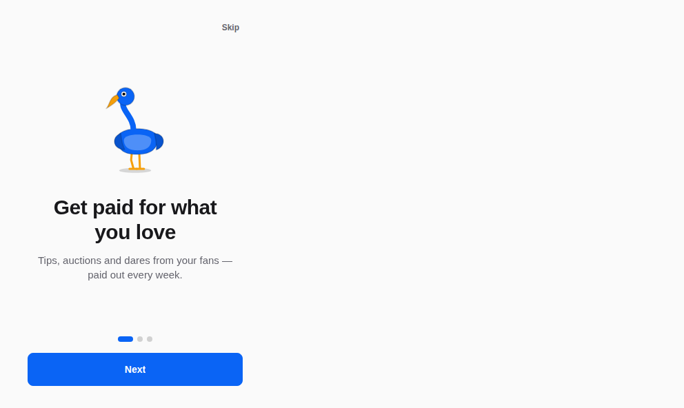
First launch
Orochia's three promises.

Props
A first launch in a few slides: swipe or tap Next, Skip at any time, dots that say where you are, the safe areas kept. Each slide is announced with its position; the buttons do everything a swipe does.
| Prop | Type | Default | Description |
|---|---|---|---|
labelsrequired | { next: string; done: string; skip: string; position: (n: number, total: number) => string; } | — | The words of the buttons — passed translated. |
onDonerequired | () => void | — | Called by “Get started” and “Skip”: remember it and leave. |
slidesrequired | readonly OnboardingSlide[] | — | The slides, three or four. |
style | StyleProp<ViewStyle> | — | Styles merged last. |
Accessibility
- Each slide is announced with its position; the buttons do everything a swipe does.
- The safe areas are kept.
Best practices
- Three slides, one promise each, a bird each.
- Remember that it was seen in
onDone; never show it twice.
Related components
Generated from the code of @krizaka/ui 3.8.0: its meta.ts, its examples and its types.Edit this documentation on GitHub