Header
A screen's header: the bar under the status bar, and a large title that folds into it as the content scrolls.
Mobile uniquement — React Native, depuis @krizaka/ui/native. Bêta : son API peut encore changer à une version mineure.
Pourquoi il est là. the native apps: Yasakia (PY4), Yororis (PYO2), Orochia mobile (PS6), Orazaka mobile: the header of every screen.
Quand l’utiliser
- The top of a section of the app: Earnings, Messages, Jobs.
- A detail screen with a back button (
size="inline").
Quand ne pas l’utiliser
- For the app's sections.À la place : Tab bar
- For a page header on the web.À la place : Page header
Installation
Installer
npx expo install react-native-svg
npm install @krizaka/ui
Importer
import { Header, useCollapsingHeader } from "@krizaka/ui/native";Enveloppez l’application une fois dans ThemeProvider de @krizaka/ui/native : chaque composant lit ses rôles de couleur.
Exemples
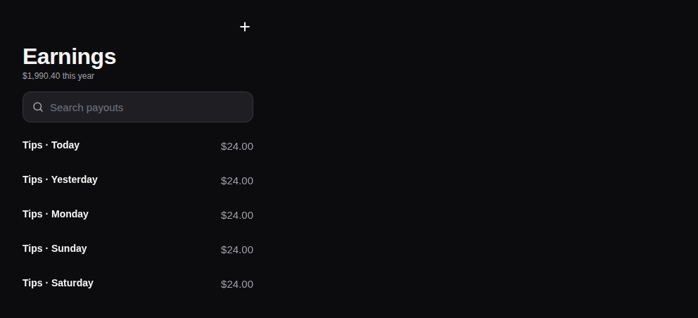
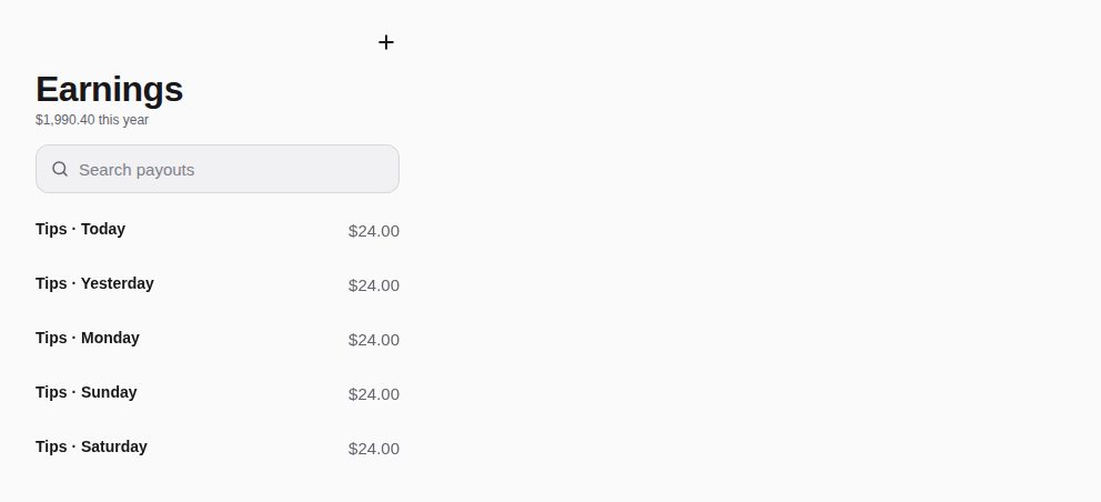
React Native n’a pas d’aperçu en direct sur le web : chaque exemple montre la capture de sa story, testée dans les deux thèmes, et le code à copier.
Large title
Folds into the bar as the list scrolls; a search field under it.
Props
A screen's header: the bar (back, title, actions) under the status bar's safe area, and a large title that folds into
the bar as the content scrolls — the iOS idiom, readable on Android. Feed it the list's scroll with
useCollapsingHeader(). The title is the screen's heading for screen readers either way.
| Prop | Type | Défaut | Description |
|---|---|---|---|
titlerequis | string | — | The screen's title — a heading, shown large under the bar until the content scrolls under it. |
actions | ReactNode | — | Buttons at the right of the bar (IconButtons). |
backLabel | string | — | The back button's words (“Back”) — passed translated; with onBack it shows. |
children | ReactNode | — | Under the title: a SearchField, Tabs. |
onBack | (() => void) | — | Called by the back button. |
scrollY | Value | — | The scroll position of the screen's list (useCollapsingHeader().scrollY): the large title folds into the bar. Absent: always large. |
size | "inline" | "large" | large | large (default: the top of a section) or inline (a detail screen: the title in the bar only). |
style | StyleProp<ViewStyle> | — | Styles merged last. |
subtitle | string | — | A line under the large title (a count, a date). |
Accessibilité
- The title is the screen's heading for screen readers, folded or not.
- The back button is named by
backLabel.
Bonnes pratiques
- Feed it the list's scroll with
useCollapsingHeader(). - Put a search field or tabs under the title as
children. - Two actions at most in the bar.
Composants liés
Générée depuis le code de @krizaka/ui 3.18.2 : son meta.ts, ses exemples et ses types.Modifier cette documentation sur GitHub